Screenshots


Screenshots » id:40810
|
||||||||
|
||||||||
|
Score: 4.00
Votes: 21 |
||||||||
| Classification | Player » Doluka | |||||||
| Tags | ffxi art Dat_mod Gungnir_swap_with_Lightbringer_parts_added | |||||||
| Date Submitted | 2010-04-30 08:11:07 | |||||||
| Links | Square - Small - Large - Original | |||||||
| Browse Options | Show Only: | |||||||


 | Score: 3   |
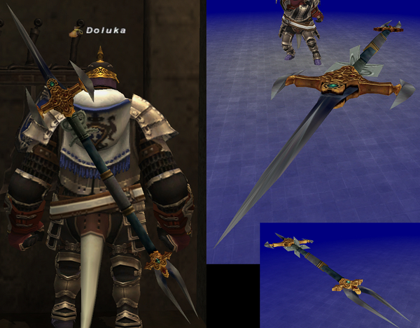
If anybody has any suggestions on what would make it look better I'm all ears. EDIT: I appreciate all of the feedback and have removed the flaps as I didn't think they looked very good either after looking at them. I also moved the middle bit more towards the center and scaled down the entire weapon somewhat. It can be seen in the URL posted below. http://i175.photobucket.com/albums/w156/Doluka/KainsLance3.jpg?t=1272681562 2010-04-30 21:43:44 | |
 | Score: 2 |
Kudos Brian. I couldn't do this ***if you paid me to and i sure wouldn't have the balls to put my work on here for the trolls. I think eizenzahn V5.3 looks great! 2010-04-30 16:56:49 | |
 | Score: 1 |
Looks too much like a Weapon you'd find in World of Warcraft. Though lacking variety, I really like SE's more subtle designs. Of course, just because I don't like it, doesn't mean it's not well-done. Everything's pretty clean and it doesn't look too out of place (Except for those weird flaps). I give it an 8. 2010-04-30 20:55:40 | |
 | Score: 0 |
Its good I would change the bottom maybe one point and not two and not have the middle handle big like Tamruan suggested. Otherwise looks great 9/10 2010-04-30 18:13:59 | |
 | Score: 0 |
The image on the top right is cool, would make an awesome lookin sword. Any chance you can make a dat for that? 2010-04-30 12:55:52 | |
 | Score: 0 |
Personally I would take off the 4 seemingly random flaps under the hilt on on the top part of the polearm. And maybe take out the random bulge in the grip, kinda no need for it. 2010-04-30 16:10:08 | |
 | Score: 0 |
Any chance of porting this to Hume Male? 2010-04-30 17:50:57 | |
 | Score: -6 |
Looks more like something you use at a parade that would break the second you actually tried fighting with it 2010-04-30 21:01:25 | |
 | Score: -7 |
top part decent i would use it it maybe, but all of it together i agree is awful 2010-04-30 11:12:54 | |
 | Show Score: -15 |
Awful. 2010-04-30 10:54:19 |
All FFXI content and images © 2002-2025 SQUARE ENIX CO., LTD. FINAL
FANTASY is a registered trademark of Square Enix Co., Ltd.